Introduction
The table below demonstrates four methods used to represent relationships.
| Written out in words or stated as a problem |  |
 |
Organized as numbers in a data table |
| Written symbolically in an equation |  |
 |
Arranged visually in a graph |
In this lesson, we will focus on generating and interpreting relationships that are arranged visually in a graph.
People frequently use graphs to interpret relationships and make predictions. For example, business people use graphs of data to make purchasing decisions for their company. Investment bankers use graphs of data to make decisions about which stocks and bonds to buy. The media also uses graphs to communicate information to the public about the economy, population, and other socially important statistics.
Because graphs are so frequently used, it is important to understand how to correctly interpret data that is presented in graphical form.
Generating Graphs from Data
A table is an efficient way to organize numerical data. In a previous lesson, you investigated different ways to generate a graph when given a table, and different ways to generate a table when given a graph.
Consider the graph of the equation y = 0.5x – 4 and a table of data.
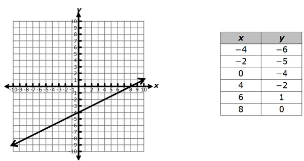
How can we tell if the points contained in the table actually lie on the graph of the line y = 0.5x – 4? One way to do so is to plot the points contained in the table on the graph, and test each point to see if it lies on the line.
Use a plotting applet to graph both the line and the points in the table. This tool will allow you to confirm whether or not the points in the table lie on the graph of the line.
Use the graph and table provided to determine which points lie on the graph of the line.
Click here for applet instructions.
Use the interactive below to identify which points from the table lie on the graph of the line:
y = 0.5x – 4
For each ordered pair, place it in the Lies on Line box if the point lies on the line, or in the Does NOT Lie on Line box if the point does not lie on the line.
Practice
Use the graphing applet to determine which of the following tables contain only points that lie on the graph of the line
| Table A | |
|---|---|
| x | y |
| -9 | 0 |
| -3 | 2 |
| 0 | 3 |
| 2 | |
| 6 | 5 |
| Table B | |
|---|---|
| x | y |
| -9 | 0 |
| -3 | 3 |
| 0 | 3 |
| 4 | |
| 6 | 5 |
| Table C | |
|---|---|
| x | y |
| -9 | 0 |
| -3 | 2 |
| 1 | |
| 3 | 4 |
| 9 | 6 |
| Table D | |
|---|---|
| x | y |
| 0 | -9 |
| 2 | -3 |
| 1 | |
| 4 | 3 |
| 6 | 9 |
Making Predictions from Scatterplots and Graphs
In this section, you will investigate ways to make predictions about data using scatterplots and other graphs.
The table below contains data describing the population of the United States as determined by the census.
| Year | Year Number (since 1900) |
Population |
|---|---|---|
| 1940 | 40 | 132122446 |
| 1950 | 50 | 152271417 |
| 1960 | 60 | 180671158 |
| 1970 | 70 | 205052174 |
| 1980 | 80 | 227224681 |
| 1990 | 90 | 249464396 |
| 2000 | 100 | 281421906 |
Use the graphing applet to make a scatterplot of population versus year number. Use the scatterplot that is generated to answer the questions that follow.
Click to see additional instructions for using the applet.
To better use the applet, copy and paste the data from this table, which is a simplified version of the table that was presented above.
| Year Number (since 1900) |
Population |
|---|---|
| 40 | 132122446 |
| 50 | 152271417 |
| 60 | 180671158 |
| 70 | 205052174 |
| 80 | 227224681 |
| 90 | 249464396 |
| 100 | 281421906 |
Question 1
What was the approximate U.S. population in 1985?
Question 2
What was the approximate U.S. population in 1965?
Question 3
If the population continues changing at the current rate, what will be the approximate population in 2010?
Practice
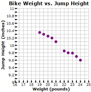
The graph shows the relationship between the weight of a bicycle and the maximum height of a jump off the ground.
Summary
When making predictions and justifying data from graphs, it is important to be able to represent data both in tables and in graphs. You can use the graph to visually follow trends that appear in the data, and use those trends to make predictions.
Sometimes, you are given the equation of a line and asked to confirm whether or not points lie on the line. One way to do so is to plot each point and then determine whether or not the point is on the line for the given equation.
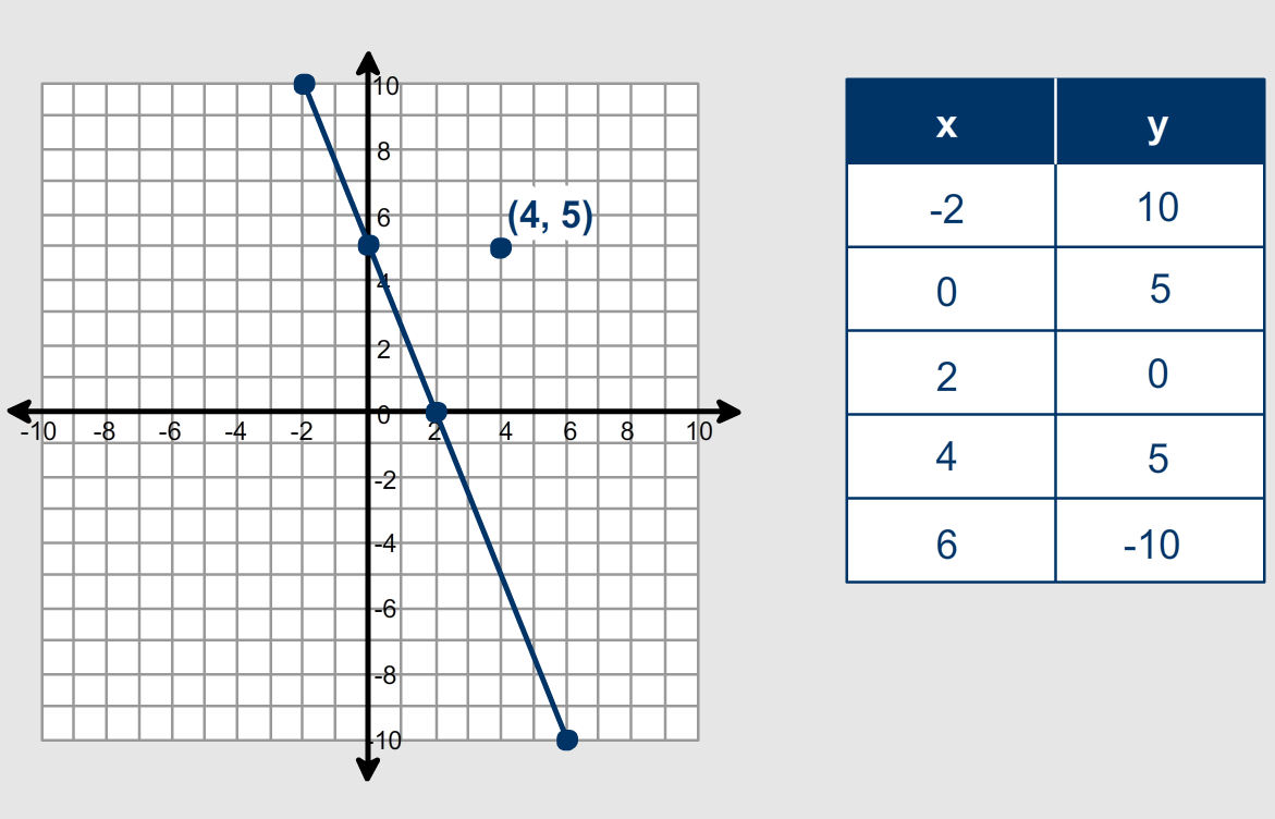
In this case, the graph of the line 5x + 2y = 10 is shown, and the points in the table are plotted on the same grid. You can see that the point (4, 5) does not lie on the line 5x + 2y = 10.
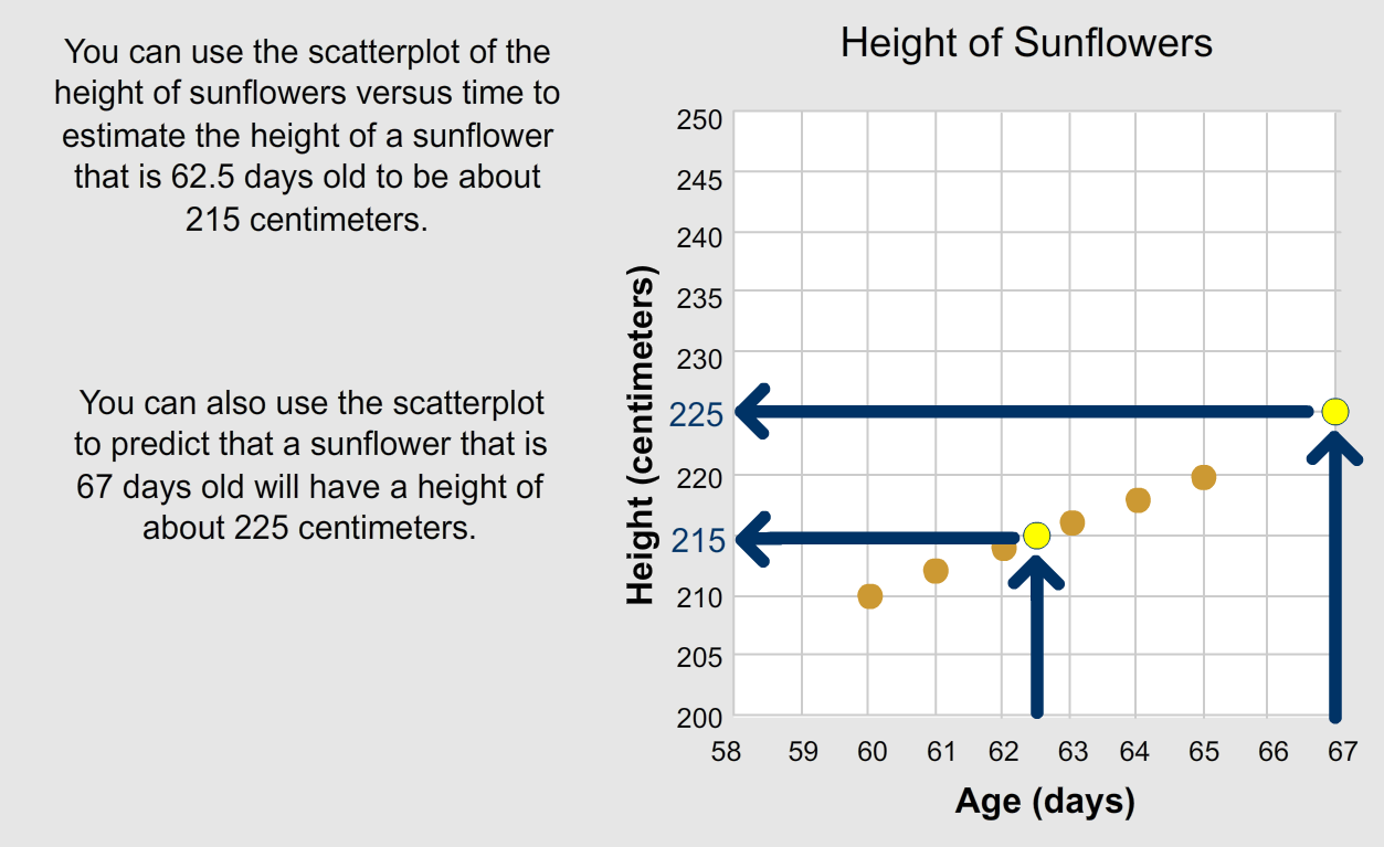
Sometimes you are given data in a scatterplot and asked to use the scatterplot to make a prediction. To do so, you can follow the trend in the data to read either between two points or to extend the pattern beyond the data.