Introduction
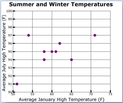
A scatterplot is a graph that is used to compare two different data sets.
|
City |
Average January |
Average July |
|
College Station |
61 |
95 |
|
Austin |
62 |
96 |
|
Longview |
58 |
94 |
|
Wichita Falls |
54 |
97 |
|
Victoria |
65 |
94 |
|
McAllen |
71 |
97 |
|
San Angelo |
60 |
95 |
|
El Paso |
58 |
95 |
|
Amarillo |
51 |
91 |
A scatterplot is created by rewriting the table values as a set of ordered pairs, and plotting one variable along the x-axis and one variable along the y-axis.

Scatterplots are typically used to determine if there is a relationship between the two variables. Researchers, engineers, and statisticians frequently use scatterplots to look for these relationships since they are a visual representation. In a scatterplot, you may spot trends that you don't easily see in a data table.
In this lesson, you will investigate ways to distinguish between different types of relationships that can be presented in a scatterplot. If the relationship is a linear one, then you will also use a trend line to make predictions.
Distinguishing Between Linear and Non-Linear Associations
In this section, you will compare linear and non-linear associations in order to distinguish between the two types of association in bivariate data. An association between two data sets occurs when there is a relationship between the values in one data set and the values in the other data set.
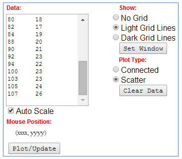
Use The ScatterPlot grapher by clicking the image below. The grapher will open in a new tab or window.
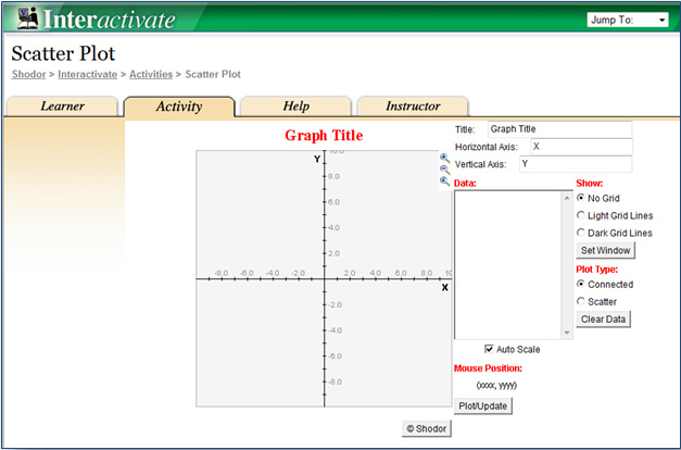
Click for additional directions on how to use the grapher.
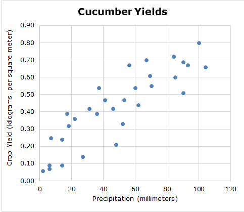
1. The table below contains data relating the weight of an alligator in pounds to the length of an alligator in inches.
|
Alligator Size
|
|
|
Weight of Alligator
(pounds) |
Length of Alligator
(inches) |
|
86
|
83
|
|
88
|
70
|
|
72
|
61
|
|
74
|
54
|
|
61
|
44
|
|
90
|
106
|
|
89
|
84
|
|
68
|
39
|
|
76
|
42
|
|
114
|
197
|
|
90
|
102
|
|
78
|
57
|
|
94
|
130
|
|
74
|
51
|
|
147
|
640
|
|
58
|
28
|
|
86
|
80
|
|
94
|
110
|
|
63
|
33
|
|
86
|
90
|
|
69
|
36
|
|
72
|
38
|
|
128
|
366
|
|
85
|
84
|
|
82
|
80
|
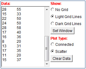
Copy the numeric portion of the data only (i.e., do not copy the row headers). Paste the data into the Data box of the grapher.
2. In the grapher, use the radio buttons to show the Light Grid Lines and change the plot type to Scatter.
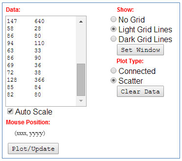
3. Click the Plot/Update button to generate a scatterplot.
4. Do the data points appear to follow a linear trend?
5. Do the data points represent a reasonably constant rate of change?
Use The Scatter Plot grapher by clicking the image below. The grapher will open in a new tab or window.
- The table below contains data relating the length of an alligator in centimeters to the belly width of an alligator in centimeters.
Alligator SizeLength of Alligator
(centimeters)Belly Width of Alligator
(centimeters)45948104885011551156136012621365146814701572177617801882178419882090219223942210023103231052410726
Copy the numeric portion of the data only (i.e., do not copy the row headers). Paste the data into the Data box of the grapher.
- In the grapher, use the radio buttons to show the Light Grid Lines and change the plot type to Scatter.
- Click the Plot/Update button to generate a scatterplot. Use the scatterplot to answer the questions below.
See a sample graph. - Do the data points appear to follow a linear trend?
- Do the data points represent a reasonably constant rate of change?
Data sets could have a linear association or a non-linear association. But not all data sets have an association. For example, consider the graph below that shows the relationship between the population according to the 2010 U.S. Census of each state and that state’s average 8th grade math score on a national mathematics test in 2013.
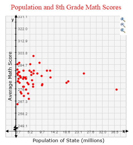
Does the data set appear to show a linear association, a non-linear association, or no association?
Pause and Reflect
- When you look at a scatterplot of data, how can you tell the difference between the appearance of the scatterplot with a linear association or a scatterplot with a non-linear association?
- How do the rates of change for linear associations and non-linear associations compare?
Practice
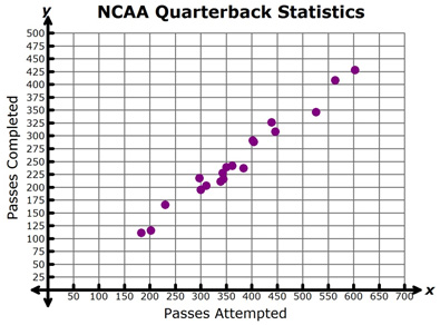
For each of the data sets below, decide whether the scatterplot best represents a linear association or non-linear association.
1. 
2. 
3. 
Distinguishing Between Positive and Negative Linear Associations
In the last section, you used scatterplots to distinguish between linear associations and non-linear associations. In this section, you will use scatterplots to distinguish between positive linear associations and negative linear associations. In a linear association, data will appear to be clustered around a trend line. Data are said to be clustered when the data values seem to be gathered around a particular value.
Describing Characteristics of Positive Trends
In this section, you will practice creating a scatterplot, and then use that scatterplot to analyze a relationship that exhibits a positive trend.
Use The ScatterPlot grapher by clicking the image below.
Click for additional directions on how to use the grapher.
- The table below contains data collected twice each month regarding the number of jars of peach preserves sold at a general store in Fredericksburg, Texas, and the number of songs that are downloaded in New York City.
Semi-Monthly Data Collection WeekNumber of Jars of Peach Preserves Sold in Fredericksburg, TexasSongs Downloaded in New York City (thousands)January 1816January 151535February 11732February 151128March 11940March 152555April 13060April 153170May 13375May 153780June 13572June 153276July 12855July 151533August 12250August 152450September 12858September 151740October 11636October 15820November 11331November 151735December 11120December 151537
Click here to open table in a new tab.
Copy the data from the Number of Jars of Peach Preserves column and Songs Downloaded column. Paste the data into the Data box of the grapher.
2. In the grapher, use the radio buttons to show the Light Grid Lines and change the plot type to Scatter.
3. Click the Plot/Update button to generate a scatterplot. Use the scatterplot to answer the questions below.
4. Do the data points appear to follow a linear association? How can you tell?
5. As you read the graph from left to right, do the points seem to move upward or downward?
6. As the number of jars of peach preserves sold in Fredericksburg, Texas increases, what happens to the number of songs downloaded in New York City?
7. If a greater number of jars of peach preserves are sold in Fredericksburg, what can you predict will happen to the number of songs downloaded in New York City?
8. Do you think that there is a cause-and-effect relationship between the number of jars of peach preserves sold in Fredericksburg, Texas, and the number of songs that is downloaded in New York City? Explain your answer.
9. If a trend line were found, would it have positive or negative slope?
10. Do you think that the relationship between the number of jars of peach preserves sold in Fredericksburg, Texas, and the number of songs that is downloaded in New York City has a positive or negative association? Why or why not?
Describing Characteristics of Negative Trends
Use The ScatterPlot grapher by clicking the image below.
Click for additional directions on how to use the grapher.
- The table below contains data describing different U.S. cities’ latitude (in degrees North from the equator) and the city’s average July high temperature.
City
Latitude (°N)
Average July High Temperature (°F)
Atlanta, Georgia
33.75
89
Austin, Texas
30.25
96
Baltimore, Maryland
39.3
87
Birmingham, Alabama
33.5
91
Boston, Massachusetts
42.6
81
Buffalo, New York
43
80
Charlotte, North Carolina
35.25
89
Chicago, Illinois
41.8
84
Cincinnati, Ohio
39
87
Cleveland, Ohio
41.3
83
Columbus, Ohio
40
85
Dallas, Texas
32.75
96
Denver, Colorado
39.75
88
Detroit, Michigan
42.3
83
Hartford, Connecticut
41.8
85
Houston, Texas
30
94
Indianapolis, Indiana
39.75
85
Jacksonville, Florida
30.2
92
Kansas City, Missouri
39
90
Louisville, Kentucky
38.25
89
Memphis, Tennessee
35.1
92
Milwaukee, Wisconsin
43
80
Minneapolis, Minnesota
45
83
Nashville, Tennessee
36.2
89
New Orleans, Louisiana
30
91
New York, New York
40.8
84
Oklahoma City, Oklahoma
35.5
94
Orlando, Florida
28.5
92
Philadelphia, Pennsylvania
40
87
Pittsburgh, Pennsylvania
40.5
83
Portland, Oregon
45.5
81
Providence, Rhode Island
41.8
83
Raleigh, North Carolina
35.75
90
Richmond, Virginia
37.5
90
Riverside, California
34
95
Rochester, New York
43.2
81
Sacramento, California
38.6
92
Salt Lake City, Utah
40.75
93
San Antonio, Texas
29.5
95
San Jose, California
37.3
82
Seattle, Washington
47.6
76
St. Louis, Missouri
38.6
89
Tampa, Florida
28
90
Virginia Beach, Virginia
36.8
87
Washington, DC
38.8
88
Copy the data from the Latitude (°N) column and Average July High Temperature (°F) column. Paste the data into the Data box of the grapher.
2. In the grapher, use the radio buttons to show the Light Brid Lines and change the plot type to Scatter.
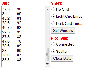
3. Click the Plot/Update button to generate a scatterplot. Use the scatterplot to answer the questions below.
4. Do the data points appear to follow a linear association? How can you tell?
5. As you read the graph from left to right, do the points seem to move upward or downward?
6. As the latitude of the city increases, what happens to the city’s average July high temperature?
7. If a randomly chosen city has greater latitude, what can you predict will be that city’s average July high temperature?
8. Do you think that there is a cause-and-effect relationship between the latitude of a city and that city's average July high temperature? Explain your answer.
9. If a trend line were found, would it have positive or negative slope?
10. Do you think that the relationship between the latitude of a city and that city's average July high temperature has a positive or negative association? Why or why not?
Pause and Reflect
- How can you tell from a scatterplot whether a set of data shows a positive linear association or a negative linear association? (Hint: think about the slope of the line approximating the data.)
- How could a trend line help you to determine if the slope is positive or negative?
Practice
Determine whether each of the graphs below shows a positive linear association or a negative linear association.
1. 
2. 
Using Trend Lines to Make Predictions
In the last section, you studied the difference between positive linear associations and negative linear associations. Once you know that a data set has a linear association, you can use a trend line to make predictions. In this section, you will practice generating a trend line and using that trend line to make predictions from the data.
The graph below shows the relationship between the length of an alligator (in centimeters) and the belly width of an alligator (in centimeters).
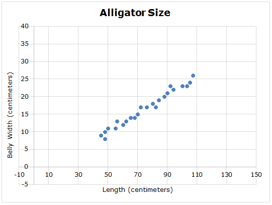
Click and drag the circles below to place a trend line on the graph. Your trend line will not connect every point, but should follow the trend in the data.
Use the trend line you estimated in the graph to answer the questions below.
- What is the y-intercept, or starting point, of your trend line?
- What is the approximate slope of your trend line?
- Use your trend line to estimate the belly width of an alligator that has a length of 30 centimeters.
- Use your trend line to estimate the length of an alligator that has a belly width of 35 centimeters.
Pause and Reflect
How does a trend line help you to make predictions from a scatterplot?
Practice
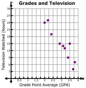
1. The graph below shows the relationship between the amount of television watched in one week and a student’s grade point average.
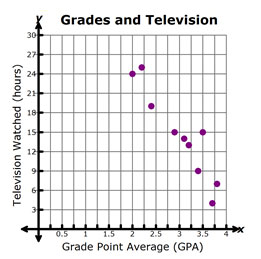
Use a trend line to estimate the grade point average a student would have if they watched 27 hours of television each week.
2. The scatterplot below shows the relationship between the sales at an ice cream store and the outdoor air temperature.
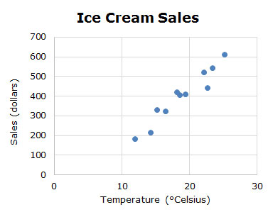
Use a trend line to estimate the temperature required for $700 in ice cream sales.
Summary
There are four types of relationships that you analyzed in this lesson.
Positive Linear Association
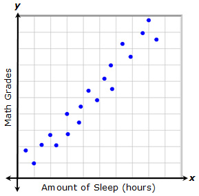
A relationship with a positive linear association is one in which both variables increase at the same time at an almost constant rate.
In this example, each point represents the amount of sleep that a student had and the grade that they received on a recent math quiz. As the amount of sleep increases, the math grade increases.
Negative Linear Association
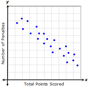
A relationship with a negative linear association is one in which as one variable increases, the other variable decreases at an almost constant rate.
In this example, each point represents the total points that a player scored and the number of penalties they received during a recent game. As the number of penalties increases, the total points scored decreases. Likewise, as the total points scored increases, the number of penalties received decreases.
Non-Linear Association
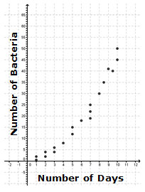
A relationship with a non-linear association is one in which as one variable increases, the other variable changes in a way that is not constant but is predictable.
In this example, as the number of days increases, the number of bacteria in a Petri dish increases. However, the number of bacteria does not increase at a constant rate, as it would for a positive linear association. Instead, the data appear to follow a curve, which is a non-linear relationship.
No Association
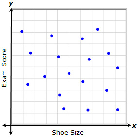
Sometimes, a relationship shows no trend. In this case, there is no detectable pattern in the data that allows you to say that as one variable changes, the second variable changes in a particular way. In this example, each point represents a student's shoe size and his or her recent social studies exam score. There does not appear to be a relationship between the shoe size and the exam score.